Pickers
moonstone/SimplePicker
moonstone/SimplePicker is a basic picker that allows the user to select items from a list.
In 5-way mode, the arrows are focusable and change the selection when pressed. (Selection state is remembered.)
In pointer mode, the user points at arrows and clicks to change the selection.
This control may be used to select from a short list of options. Since only one item is visible at a time, it is recommended that the simple picker be used in situations where the options are limited and easily understood. For example, it is appropriate to use this picker to make a selection from a list of time zones or from a short list of languages; it is not appropriate to use SimplePicker with long, data-driven lists.

Simple Picker
moonstone/SimpleIntegerPicker
moonstone/SimpleIntegerPicker is a control that prompts the user to make a selection from a range of integer-based options.
The picker may be changed programmatically by calling previous() or next(), or by modifying the published property value.
Visually, SimpleIntegerPicker is similar to SimplePicker, with the currently selected value flanked by navigation arrows on each side.
    var
        kind = require('enyo/kind'),
        SimpleIntegerPicker = require('moonstone/SimpleIntegerPicker');

    {
        kind: SimpleIntegerPicker,
        name: 'picker1',
        value: 3,
        min: 1,
        max: 10,
        step: 1,
        unit: 'sec',
        onChange: 'changed'
    }
Simple Integer Picker
moonstone/IntegerPicker
moonstone/IntegerPicker is a control used to display a list of integers and solicit a choice from the user. The integers range from min to max.
To initialize the IntegerPicker to a particular value, set the value property to the integer that should be selected, as in this example:
    var
        kind = require('enyo/kind'),
        IntegerPicker = require('moonstone/IntegerPicker');

    {
        kind: IntegerPicker,
        value: 2013,
        min: 1900,
        max: 2100,
        onChange: 'changed'
    }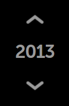
Integer Picker
The picker may be changed programmatically by modifying the published properties value, min, or max; this is done in the usual way, by calling set() while passing in the name of the property and the desired new value.
moonstone/ExpandableListItem
moonstone/ExpandableListItem is a control with an expanded state and a collapsed state. As the name suggests, ExpandableListItem is suitable for use within lists; it is also important with respect to pickers, because a variety of Moonstone picker kinds are derived from it.
A moonstone/ExpandableListItem displays a header while also allowing additional content to be stored in an enyo/Drawer; when the header is selected, the drawer opens below. The drawer is closed by tapping on the header text or navigating (via 5-way) back to the top of the drawer.
The control's child components may be of any kind; by default, they are instances of moonstone/Item.
    var
        kind = require('enyo/kind'),
        ExpandableListItem = require('moonstone/ExpandableListItem');

    components: [
        {kind: ExpandableListItem, content: 'This is an expandable list item', components: [
            {content: 'Item One'},
            {content: 'Item Two'},
            {content: 'Item Three'}
        ]}
    ]
Expandable List Item (Collapsed)
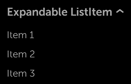
Expandable List Item (Expanded)
moonstone/ExpandablePicker
One important subkind of moonstone/ExpandableListItem is moonstone/ExpandablePicker, a drop-down picker menu that solicits a choice from the user. The picker's child components, instances of moonstone/CheckboxItem by default, provide the options for the picker.
    var
        kind = require('enyo/kind'),
        ExpandablePicker = require('moonstone/ExpandablePicker');

    components: [
        {kind: ExpandablePicker, noneText: 'Nothing selected',
            content: 'Expandable Picker', components: [
                {content: 'English'},
                {content: 'Spanish', active: true},
                {content: 'French'},
                {content: 'German'},
                {content: 'Italian'}
            ]
        }
    ]
The currently selected item is available in the picker's selected property and may be accessed in the normal manner, by calling get('selected') and set('selected', <value>). Similarly, the index of the current selection is available in selectedIndex.
The current selection appears beneath the label when the control is closed.

Expandable Picker (Collapsed)
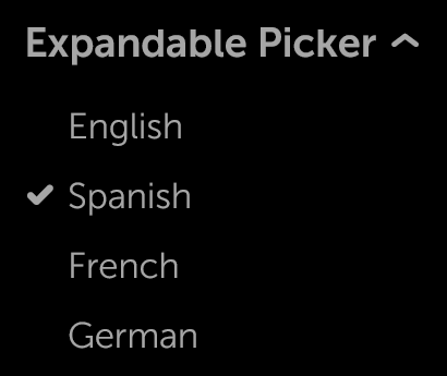
Expandable Picker (Expanded)
Like moonstone/ExpandableListItem, moonstone/ExpandablePicker may also be used inline within lists.
moonstone/ExpandableDataPicker
moonstone/ExpandableDataPicker extends moonstone/ExpandablePicker, adding support for the Enyo data layer. It is rendered as a drop-down picker menu that solicits a choice from the user.
In its collection property, ExpandableDataPicker keeps a reference to an associated enyo/Collection. The models in this collection provide the data for the picker's items, which are instances of moonstone/CheckboxItem by default.
    var
        kind = require('enyo/kind'),
        Collection = require('enyo/Collection'),
        ExpandableDataPicker = require('moonstone/ExpandableDataPicker');

    {name: 'picker', kind: ExpandableDataPicker, content: 'Expandable Data Picker',
        noneText: 'Nothing Selected', components: [
            {bindings: [
                {from: '.model.label', to: '.content'}
            ]}
        ]
    }

    ...

    this.$.picker.set('collection', new Collection([
        {label: 'first'},
        {label: 'second'},
        {label: 'third'}
    ])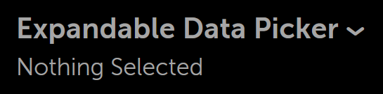
Expandable Data Picker (Collapsed)
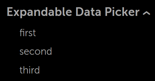
Expandable Data Picker (Expanded)
moonstone/ExpandableIntegerPicker
Another kind derived from moonstone/ExpandableListItem is moonstone/ExpandableIntegerPicker, a drop-down picker menu that prompts the user to make a selection from a range of integer-based options.
The value of the currently selected item is available in the picker's value property, while the content of the item is available in content.
    var
        kind = require('enyo/kind'),
        ExpandableIntegerPicker = require('moonstone/ExpandableIntegerPicker');

    {
        kind: ExpandableIntegerPicker,
        noneText: 'Not Selected',
        autoCollapse: true,
        content: 'Integer Picker',
        value: 7,
        min: 3,
        max: 15,
        step: 1,
        unit: 'elephants'
    }
Expandable Integer Picker (Collapsed)
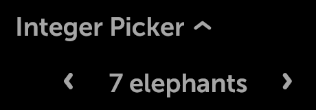
Expandable Integer Picker (Expanded)
moonstone/DatePicker
moonstone/DatePicker, yet another subkind of moonstone/ExpandableListItem, contains fields that allow the user to choose a day, month, and year.
An onChange event is fired whenever the user selects a new value for one of the fields. This event contains a standard JavaScript Date object representing the current date.
    var
        kind = require('enyo/kind'),
        DatePicker = require('moonstone/DatePicker');

    {
        kind: DatePicker,
        name: 'picker',
        noneText: $L('Pick a Date'),
        content: 'Date',
        onChange: 'changed',
        yearText: $L('year'),
        monthText: $L('month'),
        dayText: $L('day')
    }
Date Picker (Collapsed)

Date Picker (Expanded)
moonstone/TimePicker
The moonstone/TimePicker control has fields that allow the user to choose an hour value, minute value, and optional meridiem (AM/PM) value.
Like moonstone/DatePicker, moonstone/TimePicker extends moonstone/ExpandableListItem, so it has an expanded form and a collapsed form. The expanded form is displayed when the picker has focus.
An onChange event is fired whenever the user selects a new value for one of the fields. This event contains a standard JavaScript Date object representing the current date.
    var
        kind = require('enyo/kind'),
        TimePicker = require('moonstone/TimePicker');

    {
        kind: TimePicker,
        name: 'picker',
        content: 'Time',
        meridiemEnable: true,
        onChange: 'changed',
        hourText: $L('hour'),
        minuteText: $L('minute'),
        meridiemText: $L('meridiem')
    }
Time Picker (Collapsed)
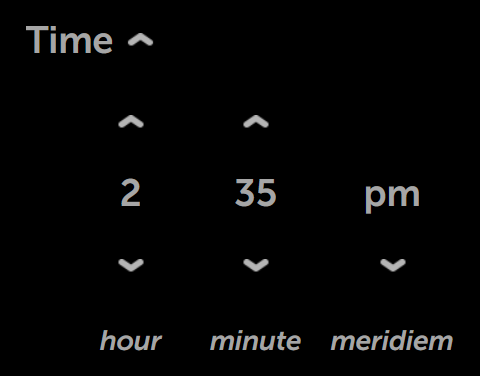
Time Picker (Expanded)
moonstone/Calendar
Though not descended from moonstone/ExpandableListItem, moonstone/Calendar does implement picker functionality in the form of a monthly calendar, from which the user may select a particular day.
Each Calendar instance features the month name at the top and a grid of days, grouped into rows (one per week), below. The header buttons are used to navigate to the desired month; the desired day is selected by tapping on it.
    var
        kind = require('enyo/kind'),
        Calendar = require('moonstone/Calendar');

    {kind: Calendar, name: 'calendar', onChange: 'changed'}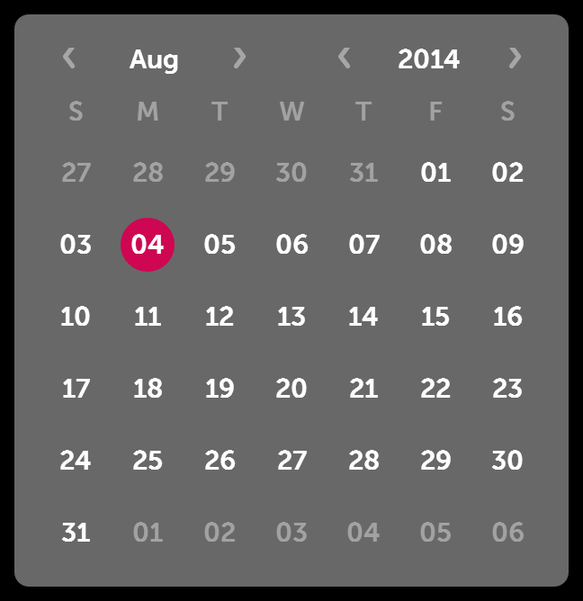
moonstone/Calendar
moonstone/Calendar/CalendarDate
moonstone/Calendar/CalendarDate is a control that represents a single day; in a moonstone/Calendar control, each day of the month is a separate CalendarDate instance.