UI Theming
Overview
Enyo offers two first-class UI widget sets: Onyx, which contains a wide variety of native-quality controls for building Enyo applications, and Moonstone, which offers controls tuned for use on smart TVs. While you are certainly welcome to use Onyx and Moonstone controls straight out of the box to develop your app, we know that many developers will want to adapt the look and feel of these widgets to meet the design requirements of their particular projects. To that end, we offer three discrete "theming" strategies.
Which strategy will work best for you depends largely on the degree of customization you need. In this document, we discuss the three approaches to theming, proceeding in order from least-effort-and-least-flexibility to most-effort-and-most-flexibility:
- Variable-Based Theming: Customization of pre-defined variables that control styling
- Rule-Override Theming: Free-form overriding of rules that control styling
- Library-Based Theming: Creation of new Enyo kinds, extending Onyx, Moonstone, or the Enyo core UI.
Variable-Based Theming
In variable-based theming, you simply override the default values of certain variables that are used to generate CSS stylesheets. For example, you could set the @onyx-toolbar-background variable to orange to make all of your app's onyx/Toolbar controls orange.
Since the 2.1 release, Enyo has included support for LESS, a dynamic stylesheet language that extends CSS with features such as variables, mixins, operations, and functions. Enyo's variable-based theming leverages LESS to break out common styling parameters into semantically-named, easy-to-override variables.
Enyo's LESS Integration
If you include .less files alongside .css files in your package.json, they can be transparently compiled into traditional CSS during the enyo pack process. This capability is enabled right out of the box, without any additional tools or setup.
Overriding Onyx Variables
Onyx's CSS lives inside two key files: onyx-variables.less and onyx-rules.less. Onyx's default theme is built from these two files and is included in your app whenever you require() and Onyx component.
If you're using the enyo-dev onyx-app template, you can easily create and use a custom theme for Onyx as follows by editing css/main.less and adding any variable or rule overrides you need.
Onyx Variables: A Quick Tour
The following is a high-level overview of the types of variables that you may define in your theme to control the look and feel of Onyx. Refer to onyx-variables.less for a complete list of the available variables and their default values.
Font:
@onyx-font-family- Font-size:
- High-level:
@onyx-font-size-small,@onyx-font-size-medium,@onyx-font-size-large - Widget-level:
@onyx-<widget-name>-font-size
- High-level:
- Text color:
- High-level:
@onyx-text-color - Widget-level:
@onyx-<widget-name>-text-color
- High-level:
- Background color:
- High-level:
@onyx-background-color - Widget-level:
@onyx-<widget-name>-background-color
- High-level:
- Border radius:
- High-level:
@onyx-border-radius,@onyx-border-radius-tight - Widget-level:
@onyx-<widget-name>-border-radius
- High-level:
- Padding
- Widget-level:
@onyx-<widget-name>-lr,@onyx-<widget-name>-tb
- Widget-level:
Icon Size:
@onyx-icon-sizeDisabled Opacity:
@onyx-disabled-opacityGradient Overlays:
@onyx-gradientand@onyx-gradient-invertImages:
@onyx-<widget-name>-image,@onyx-<widget-name>-image-width,@onyx-<widget-name>-image-height
Overriding Moonstone Variables
Similar to Onyx, Moonstone's CSS is split between variables and rules. Additionally, Moonstone includes both a light and a dark theme. To select the light theme, add the following line to your css/main.less file:
@moon-theme: 'light';When using the enyo-dev moonstone-app template, you can easily create and use a custom theme by defining any variable or rules overrides in the css/main.less file.
Moonstone Variables
Moonstone employs a much finer-grained approach to specifying default values for various controls than Onyx does. Refer to the Moonstone css directory and the corresponding light or dark less file for a complete list of the available variables and their default values.
Variable Overrides in Action
As a quick illustration of how the variable-override syntax works, if you were to create a simple "My Little Pony"-inspired theme, the main.less file might look like this:
        @onyx-text-color: pink;
        @onyx-toolbar-text-color: pink;
        @onyx-button-text-color: pink;

        @onyx-background: pink;
        @onyx-popup-background: pink;
        @onyx-toolbar-input-background: pink;

        @onyx-button-background: purple;
        @onyx-groupbox-background: purple;
        @onyx-progressbar-bar-background: purple;
        @onyx-toolbar-background: purple;
        @onyx-toolbar-button-background: purple;
        @onyx-tooltip-background: purple;

        @onyx-border-radius: 15px;
        @onyx-border-radius-tight: 15px;
If we take this custom theme and apply it to the app template--following the steps outlined above--the results are stunning:
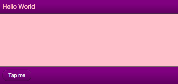
My Little Pony Theme
Rule-Override Theming
When no variable exists for the piece of CSS you want to customize, your next option is to use a CSS rule override. Rule overrides go in the aforementioned css/main.less file.
Let's say you want to change the color of the glow that surrounds a focused input. Input.less doesn't break that value out into a variable, but we can look up the name of the relevant style in Input.less and write a custom rule to override the default color.
Global Overrides
To override a rule globally (so the override applies to all widgets), simply define the rule overriding the property (or properties) whose styling you wish to customize. In the case of the input glow color, that might look like the following:
    /* Add a nice red glow to input decorators */
    .onyx-input-decorator.onyx-focused {
        box-shadow: inset 0px 1px 4px rgba(255,0,0,0.3);
    }
Selective Overrides
Of course, you may wish to be more selective about where your rule overrides are applied. In that case, simply define your rule override using a compound selector; that is, add an additional class to the definition, such as .red-glow below:
    /* Add a nice red glow to input decorators */
    .red-glow.onyx-input-decorator.onyx-focused {
        box-shadow: inset 0px 1px 4px rgba(255,0,0,0.3);
    }
Now the rule override will only affect instances of onyx.InputDecorator that have the selecting class ('red-glow') applied, e.g.:
    components: [
        {kind: OnyxInputDecorator, classes: 'red-glow', components: [
            {kind: OnyxInput}
        ]}
    ]
Alternatively, you may apply the selecting class to a parent component, which will cause all of its child input decorators to receive the override:
    components: [
        // Standard Input
        {kind: OnyxInputDecorator, components: [
            {kind: OnyxInput}
        ]},
        // Both input decorators will have 'red-glow' applied
        {classes: 'red-glow', components: [
            {kind: OnyxInputDecorator, components: [
                {kind: OnyxInput}
            ]},
            {kind: OnyxInputDecorator, components: [
                {kind: OnyxInput}
            ]}
        ]}
    ]
Library-Based Theming
Finally, there may be situations in which the look-and-feel changes you want to implement lie beyond the styling capabilities of CSS. This is often the case when DOM or behavioral changes are required.
For example, you might want to implement a "Slider" as a rotary dial instead of a horizontal track with a handle. Even if your new Slider has the exact same API as onyx/Slider (i.e., the same published properities and bubbled events), it will still require completely different DOM, CSS, and internal event tracking.
In this scenario, the idea of "theming" grows to encompass the building of a new library, made up of (one or more) Enyo kinds that implement your desired look-and-feel, while allowing you the freedom to implement custom DOM, CSS, and behavioral logic as needed.
In keeping with Enyo's emphasis on reusability, we encourage you to follow certain best practices when creating alternate UI libraries:
When possible, extend from Enyo's base UI library, found under
enyo/source/ui. That folder contains an assortment of unstyled Enyo kinds that wrap common HTML form elements, such as:- Button
- Checkbox
- Image
- Input
- Popup
- RichText
- TextArea
When providing an alternate implementation of a higher-level UI component not supplied in the base UI (such as a Menu or Slider), consider extending from the equivalent Onyx kind (and thus starting from the same API for published properties, events, and functions) and overriding where necessary.