Buttons
Behavior
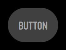
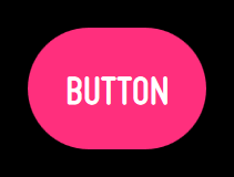
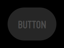
In Moonstone, a button will always be in one of four states:
Normal (up)
Pressed (down)
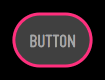
Focused (hover)
Disabled (dimmed)
When using a 5-way or Pointer remote, focusing and then pressing a button will result in the execution of the corresponding action (upon release of the button).
Note that the focused state may be animated.
moonstone/Button
moonstone/Button derives directly from enyo/Button and provides the same basic functionality, along with a dose of Moonstone visual styling.
When a moonstone/Button is tapped, it generates an ontap event; you may respond to the event by specifying a handler method, e.g.:
    var
        kind = require('enyo/kind'),
        Button = require('moonstone/Button');

    {kind: Button, content: 'tap me', ontap: 'buttonTapped'},

    ...

    buttonTapped: function (sender, ev) {
        // respond to the tap event
    }
You may apply a caption to a button by wrapping it inside a moonstone/CaptionDecorator:
    var
        kind = require('enyo/kind'),
        Button = require('moonstone/Button'),
        CaptionDecorator = require('moonstone/CaptionDecorator'),
        Scroller = require('moonstone/Scroller');

    components: [
        {name: 'scroller', kind: Scroller, fit: true, touch: true, components: [
            {classes: 'moon-button-sample-wrapper', components: [
                {kind: CaptionDecorator, side: 'top', content: 'Pow', components: [
                    {name: 'Captioned Button A', kind: Button,
                        content: 'A', ontap: 'buttonTapped'}
                ]},
                {kind: CaptionDecorator, side: 'right', content: 'Boom', components: [
                    {name: 'Captioned Button B', kind: Button,
                        content: 'B', ontap: 'buttonTapped'}
                ]},
                {kind: CaptionDecorator, side: 'bottom', content: 'Crash', components: [
                    {name: 'Captioned Button C', kind: Button,
                        content: 'C', ontap: 'buttonTapped'}
                ]},
                {kind: CaptionDecorator, side: 'left', content: 'Bang', components: [
                    {name: 'Captioned Button D', kind: Button,
                        content: 'D', ontap: 'buttonTapped'}
                ]}
            ]}
        ]}
    ]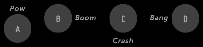
Captioned Buttons
You may create a button with smaller visible dimensions (but a normal-sized tap target) by setting small: true when declaring the button.
moonstone/IconButton
moonstone/IconButton, which extends the moonstone/Icon kind, provides a button with an image inside.
    var
        kind = require('enyo/kind'),
        IconButton = require('moonstone/IconButton');

    components: [
        {kind: IconButton, src: 'assets/icon-list.png',
            ontap: 'buttonTapped'},
        {kind: IconButton, src: 'assets/icon-list.png',
            ontap: 'buttonTapped', disabled: true}
    ]
moonstone/IconButton
To create a button with an image and accompanying text inside, use a moonstone/Icon as a component inside a moonstone/Button.