Checkboxes
Behavior
Checkboxes are used to select multiple items from a range of options. In Moonstone, the selected state is represented visually as a checkmark, while the unselected state is the absence of a checkmark (i.e., there is no visual marker).
Single selection from a range of options is implemented via radio items (otherwise known as radio buttons).
enyo/Checkbox
enyo/Checkbox implements an HTML checkbox input, with support for grouping.
The onActivate event is fired when the checkbox is tapped.
The state of the checkbox is available as a boolean (true if checked; false if not) in the checked property.
moonstone/Checkbox and moonstone/CheckboxItem
moonstone/Checkbox extends enyo/Checkbox, adding Moonstone visual styling.
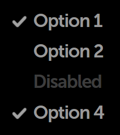
Instead of creating moonstone/Checkbox objects directly, you may find it convenient to use moonstone/CheckboxItem, which combines a checkbox with a text label, as in this example taken from the Enyo Sampler:
    var
        kind = require('enyo/kind'),
        CheckboxItem = require('moonstone/CheckboxItem');

    components: [
        {classes: 'checkbox-sample-wrapper', components: [
            {kind: CheckboxItem, content: 'Option 1', checked: true},
            {kind: CheckboxItem, content: 'Option 2'},
            {kind: CheckboxItem, disabled: true, content: 'Disabled'},
            {kind: CheckboxItem, content: 'Option 4', checked: true}
        ]}
    ]
moonstone/FormCheckbox
moonstone/FormCheckbox extends moonstone/Checkbox, providing a labeled checkbox (similar to moonstone/CheckboxItem) for use in form layouts. Unlike moonstone/CheckboxItem, moonstone/FormCheckbox has a circular "tap target" area that is always visible, regardless of whether the checkbox is currently checked.
    var
        kind = require('enyo/kind'),
        Divider = require('moonstone/Divider'),
        FormCheckbox = require('moonstone/FormCheckbox');

    components: [
        {kind: Divider, content: 'FormCheckbox Items (Default)'},
        {kind: FormCheckbox, content: 'Option 1', checked: true,
            onchange: 'itemChanged'},
        {kind: FormCheckbox, content: 'Option 2', onchange: 'itemChanged'},
        {kind: FormCheckbox, disabled: true, content: 'Disabled',
            onchange: 'itemChanged'}
    ]