Popups
enyo/Popup
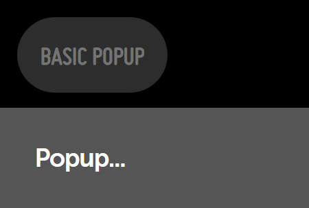
enyo/Popup is a control used to display certain content on top of other content. The following example shows a kind in which pressing a button will display a popup.
    var
        kind = require('enyo/kind'),
        Button = require('enyo/Button'),
        Popup = require('enyo/Popup');

    module.exports = kind({
        name: 'PopupExample',
        style: 'text-align: center;',
        components: [
            {kind: Button, content: 'Basic Popup', ontap: 'showPopup'},
            {name: 'basicPopup', kind: Popup, floating: true, centered: true,
                style: 'background-color: yellow; padding: 10px', onHide: 'popupHidden', components: [
                    {content: 'Popup...'}
                ]
            }
        ],
        showPopup: function (sender, ev) {
            this.$.basicPopup.show();
        },
        popupHidden: function (sender, ev) {
            // do something
        }
    });
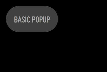
enyo/Popup (hidden)
Popups are initially hidden on creation; they can be shown by calling the show() method and re-hidden by calling hide(). A popup will fire an onShow event once shown and an onHide event once re-hidden.

enyo/Popup (shown)
You may center a popup in its viewport by setting its centered property to true; if not centered, it should be given a specific position.
A popup may be floated above all application content by setting its floating property to true. This has the advantage of guaranteeing that the popup will be displayed on top of other content. This usage is appropriate when the popup does not need to scroll along with the other content.
The autoDismiss property controls how a popup may be dismissed. If true (the default), then tapping outside the popup or pressing the ESC key will dismiss the popup.
The modal property may be set to true to prevent any controls outside the popup from responding to events while the popup is showing:
    var
        kind = require('enyo/kind'),
        Popup = require('enyo/Popup');

    {kind: Popup, centered: true, modal: true, floating: true, components: [
        {content: "Here's some information..."}
    ]}
moonstone/Popup
moonstone/Popup is an enyo/Popup that appears at the bottom of the screen and takes up the full screen width. Its features include support for scrim behavior and z-index handling, along with Moonstone visual styling.
    var
        kind = require('enyo/kind'),
        Button = require('moonstone/Button'),
        Popup = require('moonstone/Popup');

    components: [
        {kind: Button, content: 'Basic Popup', ontap: 'showPopup', popup: 'basicPopup'},
        {name: 'basicPopup', kind: Popup, content: 'Popup...'},
    ],

    ...

    showPopup: function (sender) {
        this.hidePopup();
        var p = this.$[sender.popup];
        if (p) {
            p.show();
        }
    },
    hidePopup: function () {
        this.$.basicPopup.hide();
    }
moonstone/Popup (hidden)
A scrim temporarily disables an application's user interface, covering the screen with a translucent (i.e., semi-opaque) layer. To display a scrim, set the popup's scrim property to true.
moonstone/Popup (shown)
Note that, in order to avoid obscuring the popup's contents, the scrim won't render unless the popup is floating.
moonstone/Dialog
moonstone/Dialog is a moonstone/Popup with a title, a message, and an area for additional controls.
Often, a dialog will present the user with a choice between two options, as in the following example:
    var
        kind = require('enyo/kind'),
        Button = require('moonstone/Button'),
        Dialog = require('moonstone/Dialog');

    module.exports = kind({
        name: 'DialogSample',
        classes: 'moon enyo-unselectable enyo-fit',
        components: [
            {kind: Button, content: 'Basic Dialog', ontap: 'showDialog'},
            {
                name: 'dialog',
                kind: Dialog,
                title: "You've been watching TV for a very long time.",
                message: "Perhaps it's time to take a break and get some fresh air."
                    + " "
                    + "There is a nice coffee shop around the corner.",
                components: [
                    {kind: Button, content: 'Go get a coffee', ontap: 'hideDialog'},
                    {kind: Button, content: 'Keep watching TV', ontap: 'hideDialog'}
                ]
            }
        ],
        showDialog: function (sender) {
            this.$.dialog.show();
        },
        hideDialog: function (sender, ev) {
            this.$.dialog.hide();
        }
    });
moonstone/ContextualPopup
moonstone/ContextualPopup is a modal container for content such as text, images, or buttons. It extends enyo/Popup, adding Moonstone-themed visual styling, and is typically used inside a moonstone/ContextualPopupDecorator, which couples the popup with an activating control.
    var
        kind = require('enyo/kind'),
        ContextualPopup = require('moonstone/ContextualPopup'),
        ContextualPopupDecorator = require('moonstone/ContextualPopupDecorator'),
        Scroller = require('moonstone/Scroller');

    {kind: ContextualPopupDecorator,
        style: 'position: absolute; left: 0px; top: 45%;', components: [
            {content: 'Wide'},
            {kind: ContextualPopup, classes: 'moon-6h moon-4v', components: [
                {kind: Scroller, classes: 'enyo-fill', components: [
                    {content: 'testing 1'},
                    {content: 'testing 2'}
                ]}
            ]}
        ]
    }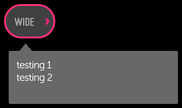
moonstone/ContextualPopup
In this example, we can tell that the "Wide" button is an instance of moonstone/ContextualPopupButton, because that is the defaultKind value of moonstone/ContextualPopupDecorator.
A contextual popup is dismissed when the user selects one of its items or clicks outside the popup's boundaries.
moonstone/Tooltip
moonstone/Tooltip, like moonstone/ContextualPopup, is a subkind of enyo/Popup that is used in tandem with a decorator--in this case, moonstone/TooltipDecorator. This control automatically displays on-screen help content when the user hovers over the decorator for a given period of time (500 ms, by default).
    var
        kind = require('enyo/kind'),
        Button = require('moonstone/Button'),
        Tooltip = require('moonstone/Tooltip'),
        TooltipDecorator = require('moonstone/TooltipDecorator');

    {kind: TooltipDecorator, style: 'display:inline-block', components: [
        {kind: Button, content: 'Tooltip'},
        {kind: Tooltip, content: "I'm a tooltip for a button."}
    ]}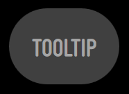
moonstone/Tooltip (hidden)
The tooltip is positioned around the decorator where there is available window space.
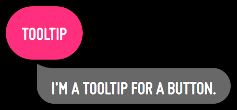
moonstone/Tooltip (shown)
Known Issues with Popups
We are aware of a WebKit bug that causes unexpected popup behavior in touch-enabled environments, such as tablets or smartphones. Specifically, when a popup is opened in front of an input control, pressing a button to dismiss the popup will cause the underlying input to receive focus when the popup closes.
We recommend that developers work around this issue on the application side, within the handler method for the button's ontouchstart event, by calling preventDefault() on the event object passed into the handler. For an example of how this is done, see http://jsfiddle.net/La44wvuf/light/.