Text Fields
The Enyo framework provides a variety of controls designed to facilitate the display and manipulation of text.
enyo/Input
enyo/Input is an enyo/Control that implements an HTML <input> element with cross-platform support for change events.
You can listen for the oninput and onchange DOM events to know when the text inside an Input has been modified. oninput fires immediately, while onchange fires when the text has changed and the input loses focus.
    var
        kind = require('enyo/kind'),
        Input = require('enyo/Input');

    components: [
        {kind: Input, name: 'myInput', placeholder: 'Enter some text...',
            oninput: 'inputChanged'}
    ],
    inputChanged: function (sender, ev) {
        // retrieve new input value
        newInputValue = this.$.myInput.get('value');
        // do something in response
    }
enyo/Input
As illustrated above, you may use the placeholder property to specify text to be displayed when the input is empty.
Also, in the event handler method, you may access the value of the input by calling get('value') (or set('value', <new value>)).
To create an input suitable for password entry, set the type property to 'password'.
Finally, two other properties of enyo/Input deserve mention. By setting the disabled property to true, you can prevent the user from entering anything into the input (presumably on a temporary basis). And by setting defaultFocus to true, you can make the input take focus when rendered. (Note that you should only do this for one input.)
moonstone/Input
moonstone/Input derives from enyo/Input and provides the same functionality with added visual styling.
Typically, a moonstone/Input is placed inside a moonstone/InputDecorator, e.g.:
    var
        kind = require('enyo/kind'),
        Input = require('moonstone/Input'),
        InputDecorator = require('moonstone/InputDecorator');

    {kind: InputDecorator, components: [
        {kind: Input, type: 'password', placeholder: 'Enter password',
            oninput: 'inputChanged'}
    ]}
moonstone/Input
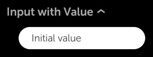
moonstone/ExpandableInput
moonstone/ExpandableInput is a moonstone/ExpandableListItem that contains a moonstone/Input within its drop-down content area.
In its collapsed state, the ExpandableInput displays its content and value. In the expanded state, the text input appears, giving the user the opportunity to change the value.
    var
        kind = require('enyo/kind'),
        ExpandableInput = require('moonstone/ExpandableInput');

    {kind: ExpandableInput, oninput: 'inputChanging', onChange: 'inputChanged',
        content: 'Input with Value', value: 'Initial value'}
moonstone/ExpandableInput (Collapsed)
moonstone/ExpandableInput (Expanded)
enyo/TextArea
enyo/TextArea is an enyo/Input that implements an HTML <textarea> element with cross-platform support for change events.
enyo/TextArea is functionally equivalent to enyo/Input; one interacts with it through the same events (oninput, onchange) and properties (value, placeholder, type, disabled, defaultFocus).
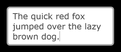
A TextArea differs from an Input mainly in that the text field it displays spans multiple lines.
    var
        kind = require('enyo/kind'),
        TextArea = require('enyo/TextArea');

    {kind: TextArea, placeholder: 'Enter some text...', oninput: 'inputChanged'}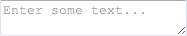
enyo/TextArea
moonstone/TextArea
moonstone/TextArea is a Moonstone-styled TextArea control, derived from enyo/TextArea. Typically, a moonstone/TextArea is placed inside a moonstone/InputDecorator, which provides styling, e.g.:
    var
        kind = require('enyo/kind'),
        InputDecorator = require('moonstone/InputDecorator'),
        TextArea = require('moonstone/TextArea');

    {kind: InputDecorator, components: [
        {kind: TextArea, oninput: 'inputChanged'}
    ]}
moonstone/TextArea
enyo/RichText
enyo/RichText is a multi-line enyo/Input that supports rich formatting, such as bold, italics, and underlining.
var
kind = require('enyo/kind'),
RichText = require('enyo/RichText');
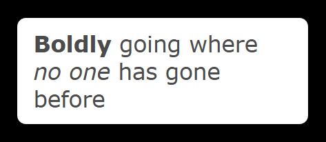
{kind: RichText,
value: '<b>Boldly</b> going where <i>no one</i> has gone before',
style: 'width: 250px;', defaultFocus: true, oninput: 'inputChanged'}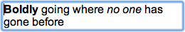
enyo/RichText
As with Input and TextArea, the text displayed in a RichText may be accessed at runtime via get('value') and set('value', <new value>).
RichText also has disabled and defaultFocus properties that function just like their counterparts in Input and TextArea.
enyo/RichText differs from Input and TextArea in having an allowHtml property. This is true by default, enabling HTML-based rich formatting. Note that the default setting allows any HTML to be inserted into the RichText, including <iframe> and <script> tags. Since this can be a security concern in some situations, you have the option of setting allowHtml to false, in which case any inserted HTML will be escaped.
RichText also differs from Input and TextArea by offering methods for manipulating the current selection and the cursor position. The selection operations and insertAtCursor() method use the HTML Editing APIs.
In addition, RichText requires explicit sizing for width.
Note that RichText is not supported on Android < 3.
moonstone/RichText
moonstone/RichText is a multi-line text input that supports rich formatting, such as bold, italics, and underlining. It is derived directly from enyo/RichText.
The content displayed in a RichText may be accessed at runtime via the value property.
    var
        kind = require('enyo/kind'),
        InputDecorator = require('moonstone/InputDecorator'),
        RichText = require('moonstone/RichText');

    {kind: InputDecorator, components: [
        {kind: RichText, oninput: 'handleInput', onchange: 'handleChange',
            value: '<b>Boldly</b> going where <i>no one</i> has gone before'}
    ]}
moonstone/RichText
moonstone/ExpandableText
Finally, moonstone/ExpandableText is an enyo/Control that allows long bodies of text to be shown or hidden.
    var
        kind = require('enyo/kind'),
        ExpandableText = require('moonstone/ExpandableText');

    {kind: ExpandableText, collapsed: true, maxLines: 3,
        content: 'I left my heart in San Francisco.'}
The current state of the ExpandableText is determined by the Boolean value of its collapsed property. If false, the ExpandableText is expanded (i.e., its content is visible); if true (the default), the ExpandableText is collapsed (i.e., its content is not visible).
ExpandableText works in conjunction with moonstone/ExpandableText/ExpandableTextButton. When an ExpandableTextButton is activated, the collapsed value of the associated ExpandableText is toggled and an onExpandCollapse event is fired.
Note that the content of an ExpandableText is not meant to be user-editable.