Toggles
moonstone/ToggleText
moonstone/ToggleText, a control that inherits from moonstone/Checkbox, looks like a switch with labels for two states. Each time it is tapped, it switches its state and fires an onChange event.
    var
        kind = require('enyo/kind'),
        ToggleText = require('moonstone/ToggleText');

    {kind: ToggleText, onContent: 'foo', offContent: 'bar',
        onChange: 'toggleTextToggle'},

    ...

    toggleTextToggle: function (sender, ev) {
        this.log('Toggled to value ' + ev.value);
    }
You may customize the appearance of the control's "on" state by setting the background color as a CSS style:
    var
        kind = require('enyo/kind'),
        ToggleText = require('moonstone/ToggleText');

    {kind: ToggleText, style: 'background-color: #35A8EE;'}
Finally, you may determine whether the toggle is currently "on" by querying its value property. The returned value will be a Boolean true or false:
    queryToggleValue: function () {
        return this.$.toggleText.get('value');
    }
moonstone/ToggleSwitch
moonstone/ToggleSwitch, which also inherits from moonstone/Checkbox, is a control that looks like a switch with an "on" state and an "off" state. When the ToggleSwitch is tapped, it switches its state and fires an onChange event.
moonstone/ToggleSwitch differs from moonstone/ToggleText mainly in that the "on" and "off" states are represented visually instead of textually. (For a look at ToggleSwitch controls in various states, see the illustration for moonstone/ToggleItem below.)
moonstone/ToggleItem
moonstone/ToggleItem derives from moonstone/CheckboxItem and provides a convenient way to combine a ToggleSwitch with a text label.
    var
        kind = require('enyo/kind'),
        Divider = require('moonstone/Divider'),
        ToggleItem = require('moonstone/ToggleItem');

    components: [
        {kind: Divider, content: 'Toggle Items'},
        {kind: ToggleItem, content: 'Option 1', checked: true,
            onchange: 'itemChanged'},
        {kind: ToggleItem, content: 'Option 2', onchange: 'itemChanged'},
        {kind: ToggleItem, disabled: true, content: 'Disabled',
            onchange: 'itemChanged'},
        {kind: ToggleItem, content: 'Option 4', checked: true,
            onchange: 'itemChanged'}
    ]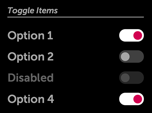
Toggle Items
Toggle items may be used with Enyo's group API. You may specify multiple toggle items as components within an enyo/Group to create a control in which only one of the items may be in the "on" state (i.e., checked: true) at a given time.
moonstone/ToggleButton
moonstone/ToggleButton, which extends moonstone/Button, is a button with two states ("on" and "off"), each of which has an associated text label. When the button is tapped, the state switches (as evidenced by updates to the text label and visual styling), and an onChange event is fired.
    var
        kind = require('enyo/kind'),
        ToggleButton = require('moonstone/ToggleButton');

    {kind: ToggleButton, toggleOnLabel: 'wifi is on',
        toggleOffLabel: 'wifi is off', ontap: 'buttonTapped'}
Toggle Button (On)
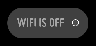
Toggle Button (Off)