Drawers
enyo/Drawer
(Note: In Enyo 2.3, the Drawer kind was moved from the Onyx library into Enyo core. The Onyx Drawer continues to exist, but is now simply an alias to enyo/Drawer.)
enyo/Drawer is a control that appears or disappears based on its open property. open is a Boolean that defaults to true, meaning that the control is visible.
By default, a Drawer appears or disappears with a sliding animation whose direction is determined by the orient property. The default value of orient is 'v', indicating that the drawer opens and closes along the vertical axis. To create a horizontally-oriented drawer, set orient to 'h'.
enyo/Drawer exposes an animated property, which may be set to false to disable the sliding animation.
Vertical Drawers
Here's a kind that implements a simple vertically-oriented drawer:
    var
        kind = require('enyo/kind'),
        Drawer = require('enyo/Drawer'),
        FittableRows = require('layout/FittableRows');

    module.exports = kind({
        name: 'VDrawer',
        components: [
            {kind: FittableRows, classes: 'outer-box', components: [
                {content: 'Activate Vertical', classes: 'inner-box inner-box-v', ontap: 'activateDrawer'},
                {name: 'drawer', kind: Drawer, open: false, components: [
                    {content: 'Vertical Drawer<br>Vertical Drawer</br>Vertical Drawer',
                        classes: 'inner-box inner-box-v', allowHtml: true}
                ]}
            ]}
        ],
        activateDrawer: function (sender, ev) {
            this.$.drawer.setOpen(!this.$.drawer.open);
        },
    });
Because we've set 'open: false' on the drawer, it starts out in the closed state when this view is loaded.

Vertical Drawer (Closed)
Then, when the "Activate Vertical" box is tapped, the activateDrawer() method toggles the open state (and visibility).
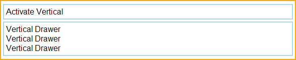
Vertical Drawer (Open)
(For details on the CSS classes used in this example, see "A Note on CSS" below.)
Horizontal Drawers
The following kind implements a simple horizontally-oriented drawer:
    var
        kind = require('enyo/kind'),
        Drawer = require('enyo/Drawer'),
        FittableColumns = require('layout/FittableColumns');

    module.exports = kind({
        name: 'HDrawer',
        components: [
            {kind: FittableColumns, ontap: 'activateColumnsDrawer', classes: 'outer-box',
                components: [
                    {content: 'Activate Horizontal', classes: 'inner-box inner-box-h'},
                    {name: 'columnsDrawer', orient: 'h', kind: Drawer, fit: true, open: false,
                        components: [
                            {content: 'Horizontal Drawer Horizontal Drawer',
                                classes: 'inner-box inner-box-h'}
                        ]
                    }
                ]
            }
        ],
        activateColumnsDrawer: function (sender, ev) {
            this.$.columnsDrawer.setOpen(!this.$.columnsDrawer.open);
        }
    });
As in the previous example, we've set 'open: false', so the drawer first appears in its closed state.

Horizontal Drawer (Closed)
A subsequent tap on the activation box toggles the open state to true (i.e., visible).

Horizontal Drawer (Open, fit: true)
Note that 'fit: true' is set on the drawer control. This causes the drawer to expand horizontally--beyond the natural width of its content--to fill the available space in the container. If we do not set 'fit: true', the drawer assumes the natural width of its content:

Horizontal Drawer (Open, Natural Width)
A Note on CSS
The examples in this document make use of the following CSS styles:
    .outer-box {
        border: 2px solid orange;
        padding: 4px;
        white-space: nowrap;
        overflow: hidden;
        margin-top: 3px;
        margin-bottom: 3px;
    }

    .inner-box {
        border: 2px solid lightblue;
        padding: 4px;
        white-space: nowrap;
        overflow: hidden;
    }

    .inner-box-v {
        margin-top: 2px;
        margin-bottom: 2px;
    }

    .inner-box-h {
        margin-left: 2px;
        margin-right: 2px;
    }
Note that there are slight differences in how margins are handled, depending on the orientation of the drawer.
moonstone/Drawers/Drawer and moonstone/Drawers/Drawers
The Moonstone library has its own implementation of drawer functionality, based on moonstone/Drawers/Drawer (which is not a subkind of enyo/Drawer) and moonstone/Drawers/Drawers (which is a container for moonstone/Drawer objects).
moonstone/Drawers/Drawer contains two areas for content--a main content area, where items declared in the components block live, and an optional controlDrawer, which houses any items declared in a controlDrawerComponents block. In addition, in its handle property, moonstone/Drawers/Drawer allows you to specify an activator control, which is displayed along with a styled label.
moonstone/Drawers/Drawer objects are designed to be placed inside a moonstone/Drawers/Drawers container. This is done by supplying an array of Drawer objects in the drawers property of the moonstone/Drawers/Drawers. The drawer handles are grouped together visually in the Drawers control; selecting a handle will activate the associated drawer, opening either the main content area or the control drawer (depending on how the Drawer is configured).
Finally, note that a moonstone/Drawers/Drawers may contain child components of any kind.

moonstone/Drawers/Drawers with Handle